Independent watch dealers track inventory in spreadsheets. Dial is a purpose-built tool for managing Rolex holdings - P&L, comparable sales, and market value in one place.
Small independent watch dealers and serious collectors - managing 5 to 20 watches at a time - rely on spreadsheets and memory to track what they own, what they paid, and what the market is doing. The result is fragmented data, slow decision-making, and missed timing on sales.
An independent Rolex dealer or serious collector managing 5–20 watches. Technically comfortable but not a developer. Checks Chrono24 daily. Tracks comps manually in a Notes app or spreadsheet. Makes buy/sell decisions based on gut feel rather than organized data.
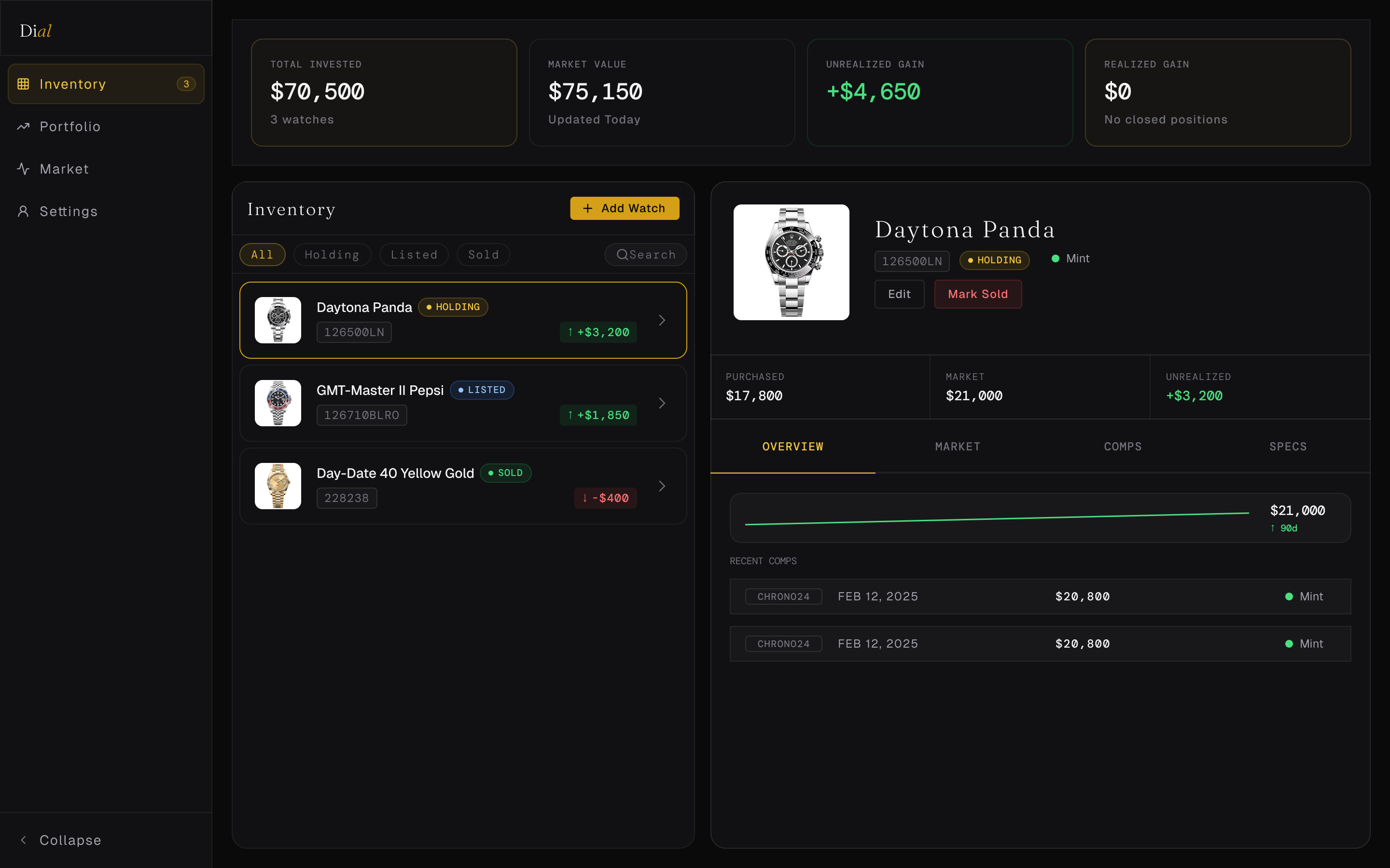
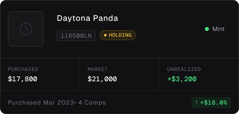
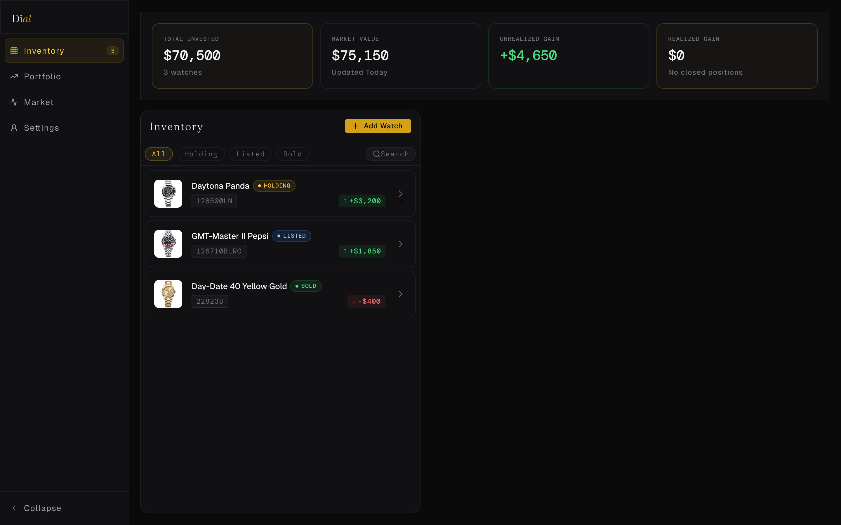
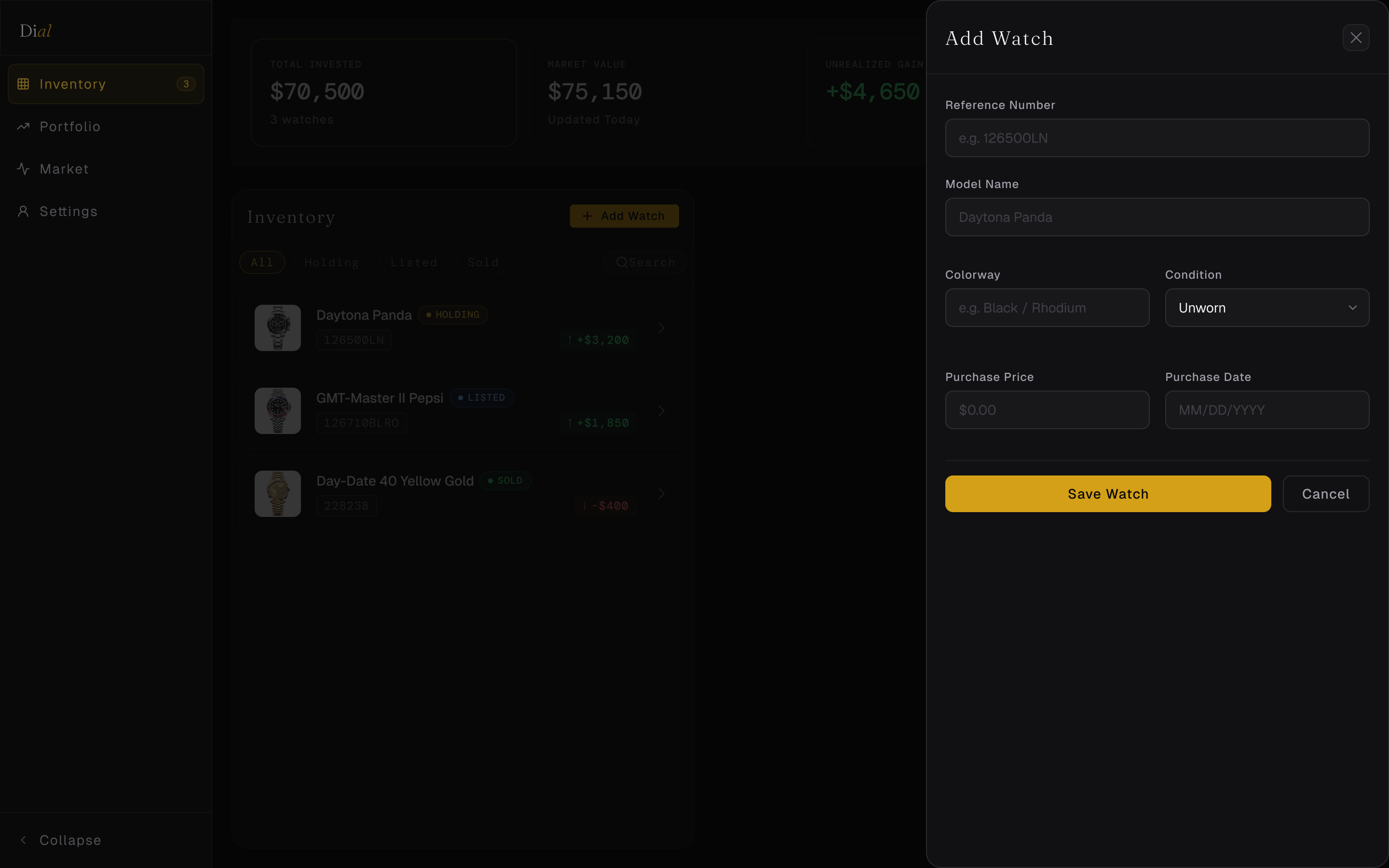
Every watch marked Holding, Listed, or Sold - at a glance, across the full portfolio.
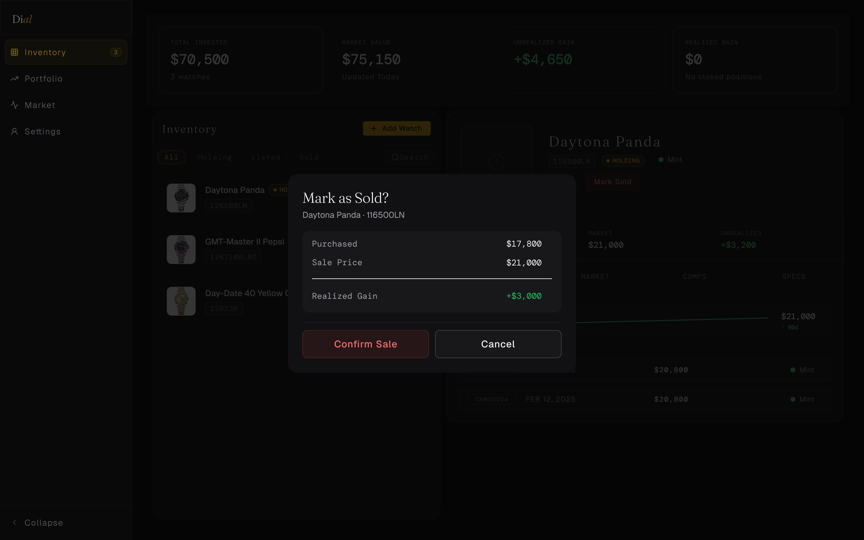
Purchase price vs. current market value vs. final sale price - tracked per watch, not per spreadsheet tab.
Attach 2–3 comps to each watch with source, date, condition, and price. Pulled from Chrono24.
Manual market value entries over time, visualized as a sparkline on each watch card.
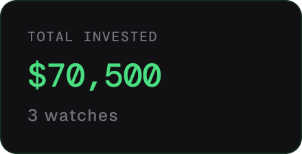
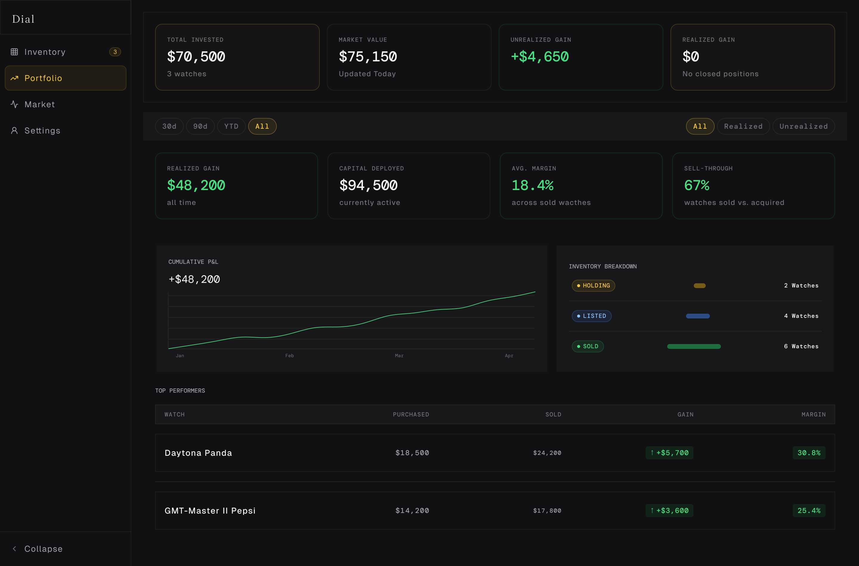
Total invested, total market value, realized and unrealized gain - always visible at the top.
Before designing a single screen, I built the full design system using Atomic Design - establishing visual language at the token level, composing it into atoms, then molecules and organisms, before any layout decisions were made.
Building screen-first creates local decisions that compound into inconsistency. A design system forces every visual decision to be made once, at the source - then referenced everywhere. Change a token, update the entire system. No hunting, no drift.
Every color, spacing value, and typography decision lives in a token. No raw hex values in component fills. No hardcoded sizes on frames. If something needs to change, it changes in one place and propagates automatically.
Figma's free plan allows only one variable collection. Solved with slash-group naming:
Primitives/Gold/500 and
Semantic/Text/Primary
live in the same collection, organized by prefix. A constraint that forced a cleaner naming system.
Three decisions that define how Dial feels - and the reasoning behind each one.
Data-dense UIs are more legible on dark backgrounds - high contrast for numbers, reduced eye strain during extended sessions. Dark also reads as premium, which aligns with the Rolex category and the serious-collector user.
Gold is the most legible warm accent on a dark background and has direct category resonance with Rolex. It's used sparingly - semantic token names (Brand/Primary) rather than color-literal names - so a future rebrand swaps one value, not dozens of component fills.
Monospace fonts are tabular by nature - digits align vertically in lists, making comparison scanning fast. Geist handles all UI copy. Fraunces handles display headings. Three fonts, three distinct roles, no overlap.
Every component in the system exported directly from Figma - the same token values, the same constraints, the real thing.
Slash-named standalone components (Badge/Holding etc.) rather than variant sets.
Three variants covering the full action hierarchy. Primary uses Brand/Primary token - swap one value to rebrand.
Default · Focus · Error states. Focus ring uses Brand/Primary at 12% opacity.
Inventory filter pills. Active state uses Brand/Primary border + tinted fill. Separate from Badge atom - different job, different component.
Three variants: subtle, labeled, and gold-accent for section breaks in the Detail Panel.
Loading state placeholder. Corner radius matches the element it replaces - applied to inner rectangle, not the outer component frame.
Three sizes: sm/32px for compact cards, md/48px for expanded cards, lg/72px for the detail panel hero.
Lucide icons at 16px. Colored via semantic tokens - Text/Secondary for neutral, Brand/Primary for positive delta, Status/Error for negative. Dropped directly at organism level rather than wrapped as instances.
Shows absolute and percentage change. "Delta" - the mathematical term for difference - is used throughout Dial's naming for this component.
Active state: gold tint + Brand/Primary icon color. Default state: tertiary text, no background.
The primary list item. Thumbnail atom + ref/name/price text + Badge atom + Delta Indicator atom, composed in Auto Layout. Compact keeps the list scannable - expanded shows more detail on hover or selection.
Same atoms as Compact, restructured for a wider layout. Used in the detail panel context where more horizontal space is available.
Used in the Portfolio Summary Bar. Label in Label/sm, value in Mono/data at 20px.
Market value trend over time. labels in DM Mono at 6px - small enough to annotate without competing with the line.
Source chip uses a fixed-width wrapper to maintain column alignment regardless of chip label length - a non-obvious Figma constraint solved with a wrapper frame.
Three-column layout using DM Mono throughout. Delta cell pulls color from the Delta Indicator atom - green for gain, red for loss, tertiary for flat.
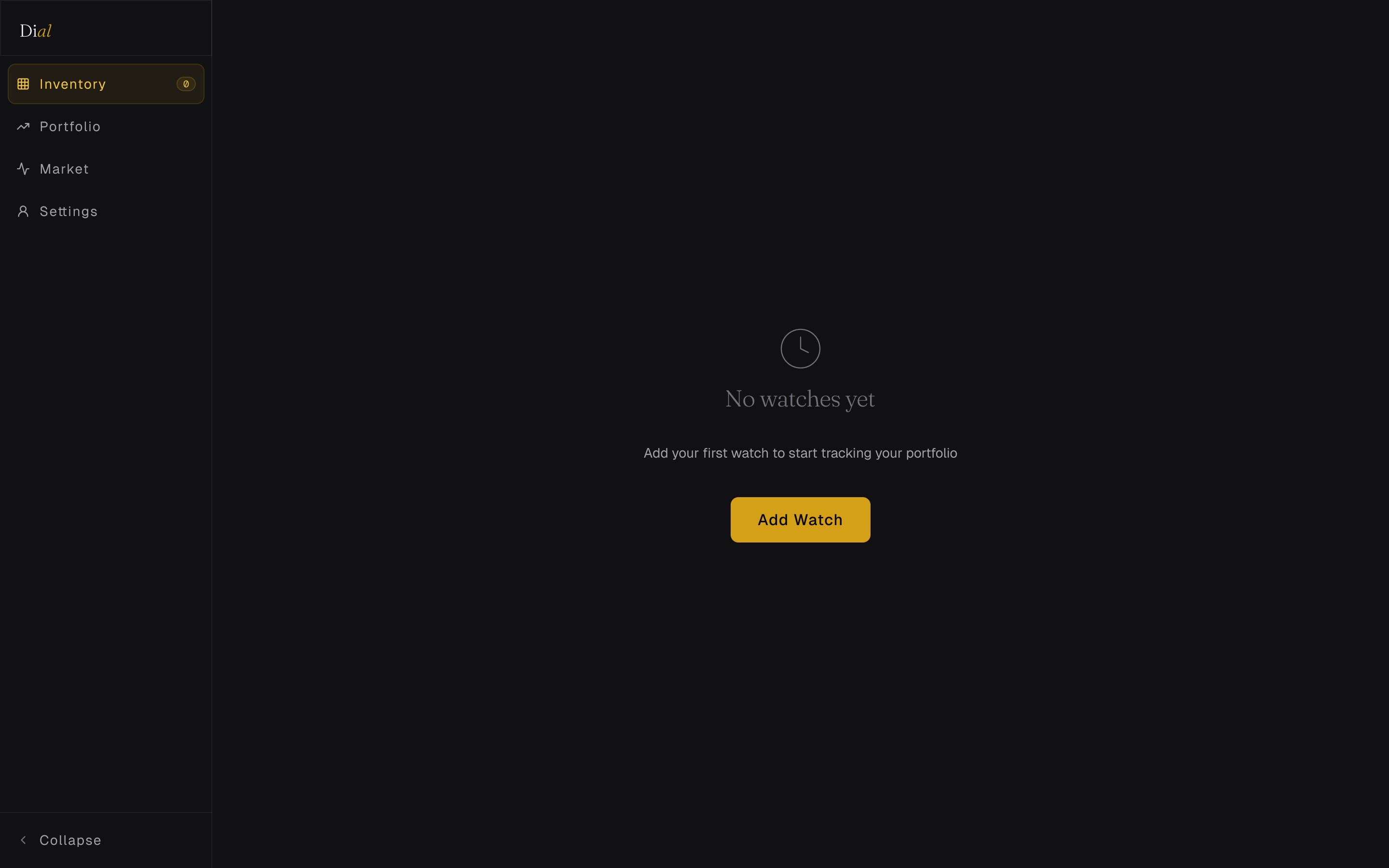
Each screen is a template filled with real watch data - reference numbers, actual prices, real comps pulled from Chrono24.
Solved with slash-group naming - Primitives/Gold/500 and Semantic/Text/Primary in the same collection, organized by prefix. Forced a cleaner naming convention than a multi-collection setup would have produced.
Badge/Holding, Badge/Listed, Badge/Sold as standalone components instead of a true variant set. Slightly more components to manage, but each is independently documented and swappable.
Lucide icons dropped directly at organism level rather than wrapped in an Icon atom instance. The Icon atom exists as documentation and engineering reference - not as a Figma instance dependency chain.
The React app uses local state for portfolio scope. Real data persistence (cloud sync, multi-device) is a next-step feature, not a launch blocker for a portfolio demonstration.